
Collecting · 6 min read
How to Light Artwork at Home
The most common way to spend real money on a print and then undo it. Angle, distance, color temperature, and what actually damages a print.
This is the step people skip. You choose the image, agonize over the size and the finish, hang it — and then light it with whatever was already in the ceiling. It's the cheapest possible way to undo a considered purchase, and it's completely avoidable.
The short version. Never direct sunlight. Aim a light at about 30° from vertical so it lands on the piece and not in your eye. Use LED at 90+ CRI. Warm or neutral white, matched to the rest of the room.
The one rule that actually matters
Don't hang anything in direct sunlight. Not "avoid where convenient" — genuinely don't. Cumulative light exposure is the single largest factor in how any print ages, and every longevity rating you'll ever read (mine included) assumes normal indoor display, not a south-facing window.
Sunlight also moves. A wall that's shaded when you hang the piece in November can take two hours of direct afternoon sun in June. Watch the wall across a day before you commit, or pick a different one.
Angle: about 30 degrees
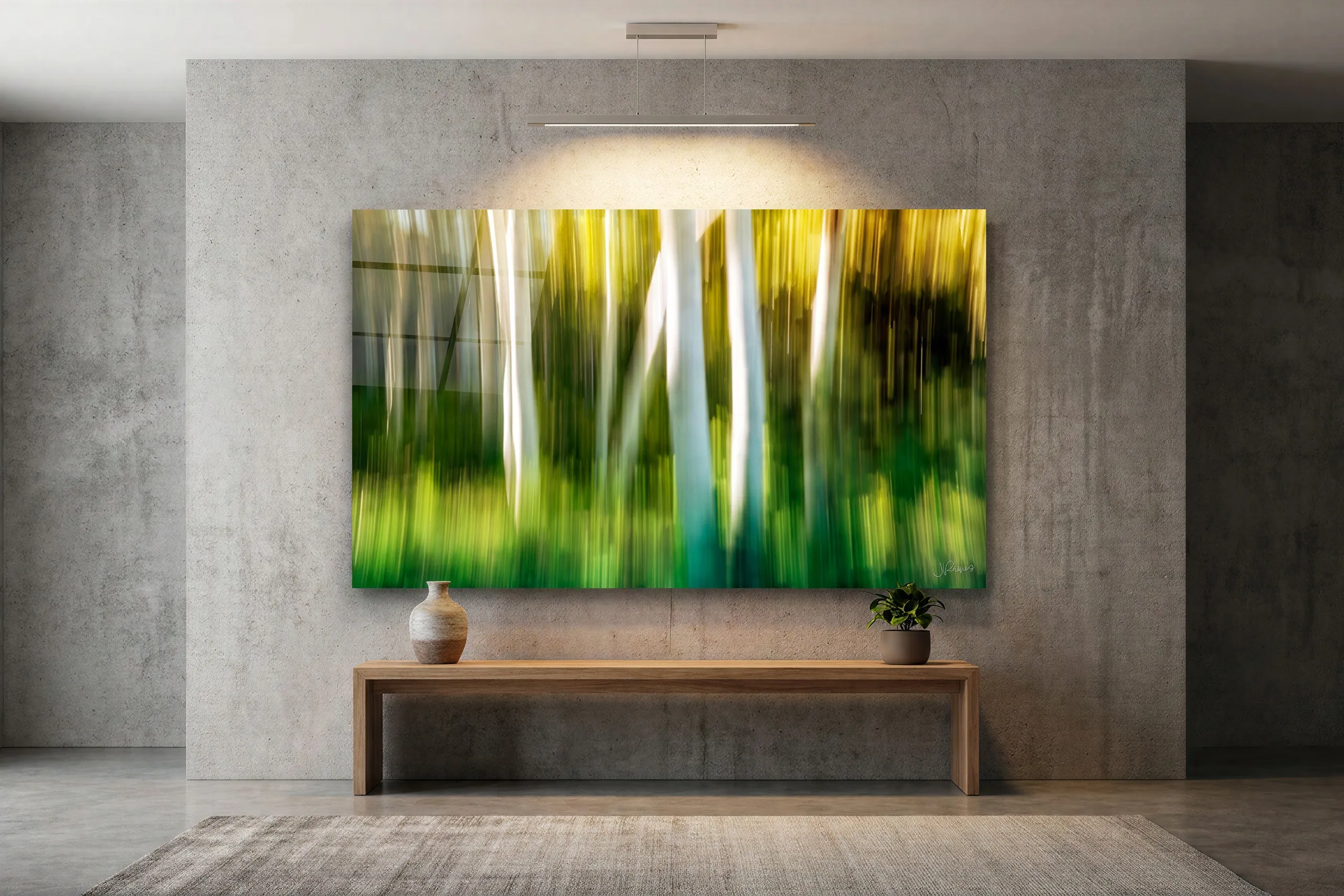
The convention in galleries is to place the light so it strikes the artwork at roughly 30° from vertical. That angle is a compromise between two failures: too steep and the light skims the surface, exaggerating any texture and throwing a shadow from the frame edge; too shallow and it bounces straight off the surface into the eye of whoever's looking.
For a larger piece, nudging toward 35° spreads the coverage more evenly top-to-bottom. If you're fitting a ceiling track, the rule of thumb is to mount the fixture roughly a third of the ceiling height out from the wall.
Bulb: LED, 90+ CRI
Two numbers worth caring about:
- CRI (color rendering index) — how faithfully a light source renders color against daylight. Below 90 and you will visibly flatten subtle color, which is exactly the part of a good print you paid for. Look for 90+, ideally 95+. Cheap LEDs are often 80 and don't advertise it.
- Color temperature — 2700K–3000K reads warm and domestic, 4000K reads neutral and more gallery-like. Neither is wrong; what matters is that it doesn't fight the other lighting in the room. A warm print under one cool spotlight in an otherwise warm room looks broken.
Modern LED is the right answer for art almost by default: effectively no UV, and almost no radiant heat. Halogen has neither of those advantages.
Brightness: less than you'd guess
Conservation practice for works on paper sits in the range of roughly 50 to 200 lux, which is far dimmer than most people light a room. You don't have to treat your living room like an archive — but the instinct to blast a print with a bright downlight is worth resisting. A piece lit two or three times brighter than its surroundings looks staged; lit slightly brighter, it draws the eye without announcing the fixture.
Put picture lights on a dimmer if you can. It's the single cheapest way to get this right, because it lets you tune the level by eye in the actual room.
The finish changes the problem
How much any of this matters depends on what's on your wall:
| Finish | Glare risk | What to do |
|---|---|---|
| Lumachrome acrylic | Lowest | Anti-reflective coated — under 1.5% surface reflectance. The most forgiving of a bright room or a window opposite. |
| Chromaluxe metal | Moderate | Gloss surface. Keep light off-axis and check the piece from where people actually stand, not from directly in front. |
| Supralume canvas | Moderate | Gloss with texture — raking light will exaggerate the weave. Keep the angle closer to 30° than 45°. |
| Fine art paper | None from the print | Matte, so no glare from the surface itself. The glare comes from whatever glazing you frame it behind — specify anti-reflective, UV-filtering glass. |

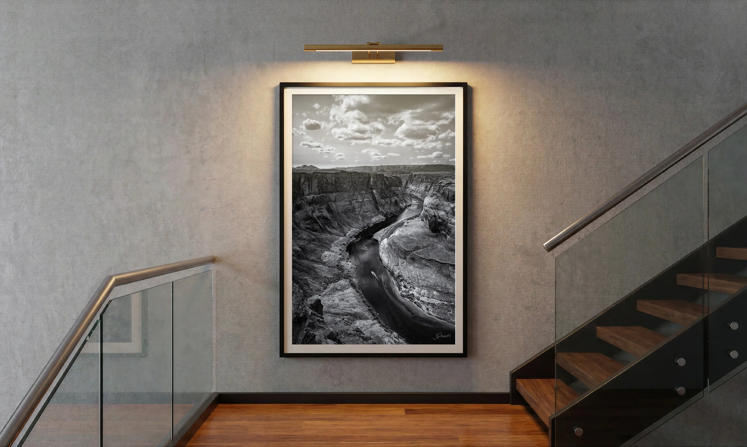
Dark, quiet images are the most sensitive to this. A bright frontal light on a piece like the one above doesn't reveal more of it — it lifts the blacks, kills the sense of depth, and turns a moody photograph into a gray one.
What actually ages a print
Longevity ratings get quoted a lot and understood rarely. The rated figures for what I sell — 65 years for metal, 120+ for the acrylic process, 50 to 80 for cotton rag paper — all describe the print under normal display conditions. What moves those numbers in real life:
- Light exposure, cumulative and mostly irreversible. The big one.
- UV specifically. The TruLife acrylic blocks up to 99% between 300 and 380 nm; framed paper needs UV-filtering glazing to get similar protection.
- Humidity swings, which matter for paper far more than for the bonded panels.
- Acidic contact materials — a cheap mat board will damage a paper print from behind while you're busy protecting the front. Specify cotton rag.
Cleaning
Metal, acrylic and Supralume all take a soft, dry or barely damp cloth. No household glass cleaner on acrylic — ammonia and alcohol will haze the coating over time. Paper behind glazing should never be cleaned directly; clean the glass, sparingly, spraying the cloth rather than the frame.
If you're not sure
Send me a photo of the room with the lights as they normally are, and tell me which wall you're thinking about. I can usually tell from that whether you've got a glare problem coming, and which finish will behave best where you want to hang it — which is a much better conversation to have before you order than after.
Still deciding?
Tell me the image and something about the room — the light, the wall, how close people stand. I'll tell you honestly what I'd hang there, even if it's the cheaper option.
Ask me directlyPrefer email? hello@jeradrainesphotography.com