
Collecting · 8 min read
Acrylic, Metal, Canvas or Paper: Choosing a Fine Art Print Medium
Four finishes, four genuinely different objects. What each one does to an image, which rooms they survive, and how to pick without seeing them in person.
Four finishes, four genuinely different objects. The names don't help much — they're mostly trademarks — and you're being asked to choose one for a piece you can't stand in front of first. So here is what actually changes between them, what each one does to an image, and how I'd pick if it were my wall.
The short version. Acrylic for depth and drama. Metal for bright, high-key scenes and anywhere damp. Canvas-on-aluminum for intricate texture, and for soft, painterly, atmospheric scenes. Paper for quiet work and black and white, if you have a framer you trust.
The one question that decides most of it
Not the room. Not the budget, at least not first. What is the image doing? Every one of these finishes does something specific to a photograph, and the right choice is the one whose behavior matches what the picture is already trying to be. A luminous, high-contrast image put on matte paper loses the thing that made you want it. A quiet, tonal black and white face-mounted to acrylic gets a glossy intensity it never asked for.
So: is this picture about light, about texture, or about tone? Everything below follows from that.
Lumachrome acrylic — for light
This is the one people mean when they say a print looks backlit. The reason is structural rather than a coating trick: the image is printed on a clear transparency layer that sits over a white reflective base, so incoming light passes through the emulsion, bounces off the white substrate, and passes through the image a second time on its way to your eye. That double transit raises effective optical density and saturation compared with a conventional print, where light meets the colorant once. It's the same reason a slide on a lightbox beats the same frame on paper.
The print is then face-mounted directly to the back of the acrylic with an optically clear silicone adhesive. Removing the air gap removes two refractive-index boundaries — which is what kills the secondary reflections and the faint parallax you get between glass and image in a conventional frame. The glazing is TruLife, anti-reflective hard-coated: under 1.5% surface reflectance mounted, against roughly 4% for uncoated acrylic. In practice that means you can hang it opposite a window and still see the photograph rather than the room.
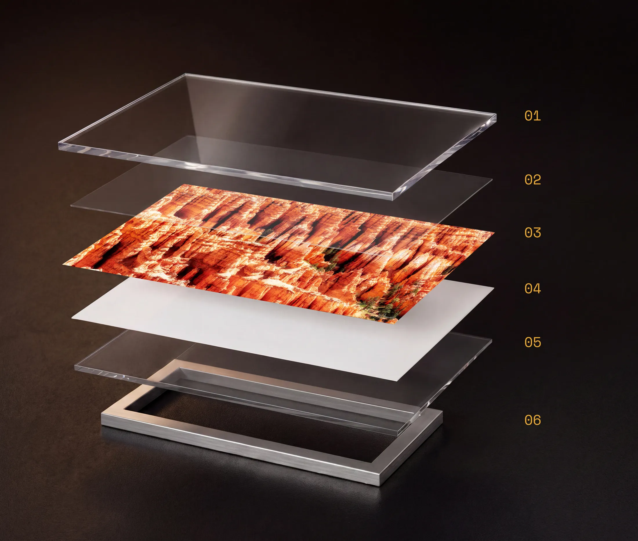
- 01TruLife Acrylic
An anti-glare acrylic face, optically bonded rather than laminated, that reads as glass without the glare or the weight.
- 02Invisible Adhesive
A clear optical bond that fuses the print to the acrylic with no visible layer or bubbling between them.
- 03Fine Art Print
A transparency layer infused with iridium particles, printed at full photographic depth for the double light-pass that gives Lumachrome its density.
- 04White Base Layer
A white polyester base behind the transparency that reflects light back through the image a second time, deepening color and contrast.
- 05Clear Acrylic Backer
A rigid acrylic sheet sealing the back of the piece, keeping the whole panel flat and stable.
- 06Rear Float Mount
A hidden hanging system that holds the panel roughly half an inch off the wall for a floating look.

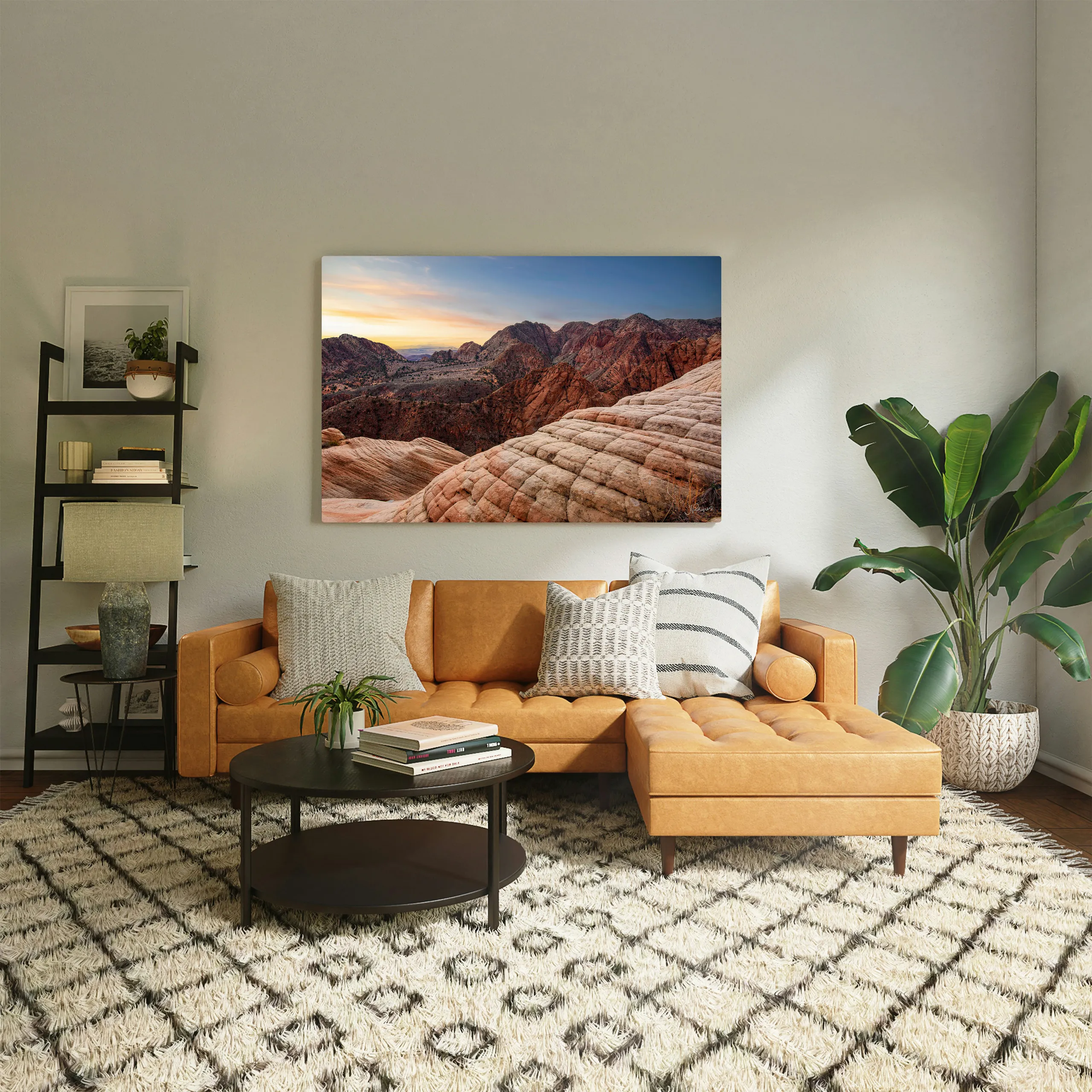
It's also the most expensive option, by a lot, and it isn't subtle. On a quiet image it can feel like shouting.
Choose it for: deep color, dramatic light, anything you want to stop someone in their tracks.
Chromaluxe metal — for bright scenes, and for damp rooms
Metal is a dye-sublimation process: under heat and pressure the dye goes straight from solid to gas, diffuses into a polymer coating bonded to the aluminum, and returns to solid inside that coating. The image ends up within the panel rather than sitting on top of it. There's no ink film at the surface at all, which removes the failure modes that need one — no scuffing, no flaking, no delamination.
That has two consequences worth knowing. The first is durability: it's unaffected by water, humidity and household chemicals, and cleans with a damp cloth. It's the only one of the four I'd hang in a bathroom or over a kitchen range without thinking about it. Wilhelm Imaging Research rates gloss white ChromaLuxe panels at 65 years on display — roughly three times archival silver-halide paper.
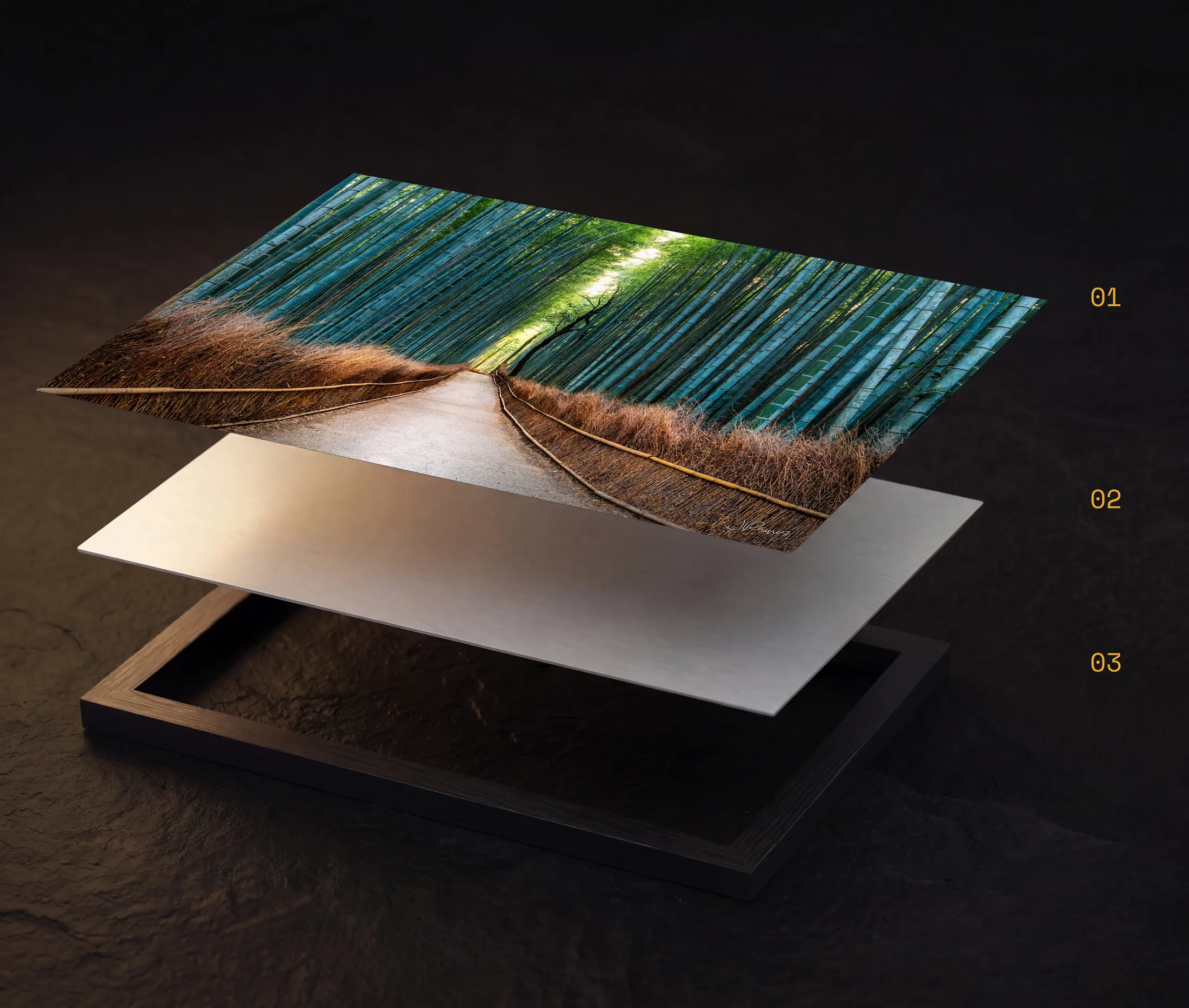
- 01Fine Art Print
The image itself, dye-sublimated directly into a polymer coating rather than sitting on top of it as ink — no surface film means nothing to scuff, flake, or fade.
- 02Aluminum Panel
A rigid ChromaLuxe aluminum substrate carries the print, giving it permanent flatness, water and humidity resistance, and a lifespan rated at roughly 65 years on display.
- 03Rear Float Mount
A hidden hanging system holds the panel roughly half an inch off the wall, so the print appears to float free of its surface with no visible frame or hardware.
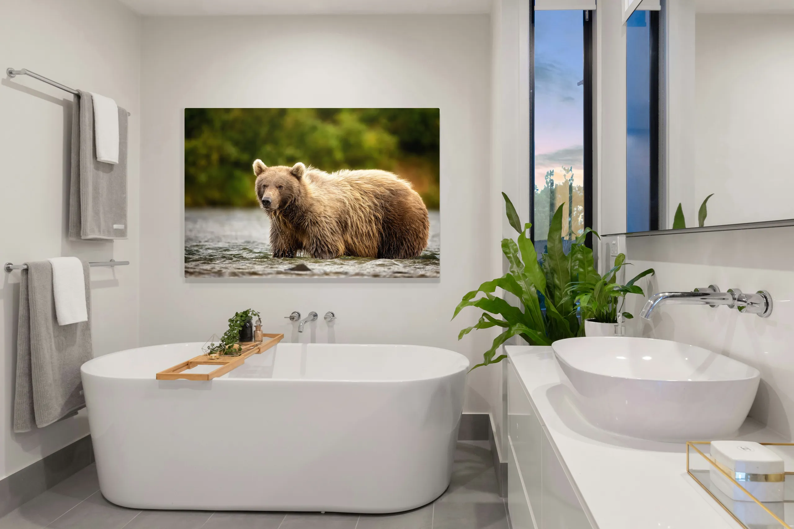
The second is optical. The white base coat under the image is reflective, so highlights return a high proportion of the light hitting them and read as luminous rather than as printed white. That effect is strongest on high-key subjects, which is exactly why I steer snow, water and big pale skies here.

Choose it for: snow, water, big skies, high-key work — and any room where humidity or cleaning is a real consideration.
Supralume canvas — for texture, and for atmosphere
Ordinary canvas has a real problem: matte and semi-gloss surfaces scatter light at the surface, and that diffusion lowers maximum black density and softens fine detail — the two things a woven substrate can least afford to lose. The usual fix is spraying gloss varnish over a matte print, but that varnish is a separate film sitting on a flexible textured surface, and it's prone to crazing along the weave as the canvas moves.
This is built the other way round. The gloss is a property of the print itself — an Ultra-Glossy HD coating applied in-process, not a topcoat — printed with oil-based pigment inks at 1200 ppi and 16-bit. High black density, water resistant, and no separate surface layer that can craze, lift or yellow. It's then surface-bonded to DiBond aluminum composite instead of stretched over a wooden frame. Stretched canvas is under continuous tension and slackens over time; a bonded panel has no tension to lose, so there's no sag, no corner distortion and nothing to re-tension in five years.

You keep the canvas surface — which some images genuinely want — without paying the usual detail penalty for it. That's the case for intricate subject matter: rock, bark, forest floor. But the weave also does something less obvious to a soft, low-contrast scene. It's a faint physical texture sitting under the print, not enough to cost you sharpness, but enough that misty light and muted color pick up something closer to a painterly quality than a photographic one — think impressionism rather than documentation. A quiet, atmospheric image like Morning Crossing above doesn't just tolerate that; the surface reinforces the mood instead of sharpening past it the way acrylic or metal would.
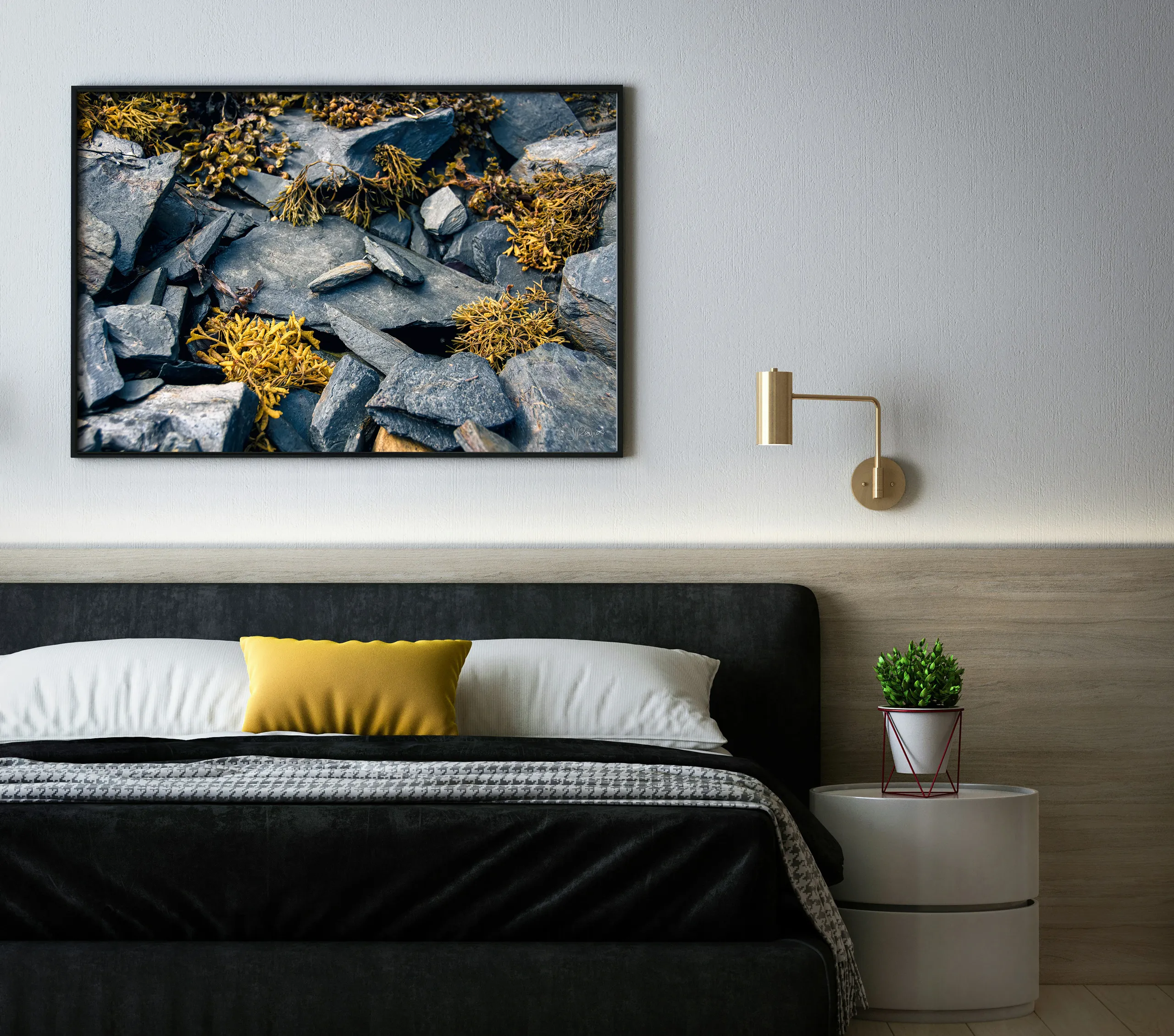
Choose it for: rock, bark, forest floor, weathered wood — anything where the subject is intricate and the surface should feel tactile. Also quieter, atmospheric scenes with soft light and muted color, where a painterly surface underlines the mood rather than sharpening past it.
Fine art paper — for tone
The traditional one, and the only one I sign by hand before it ships. The stock is Canson Infinity Rag Photographique 310: 100% cotton rag, internally buffered, acid-free, and with no optical brightening agents. That last part matters more than it sounds. OBAs are fluorescent additives that make paper read whiter under UV, and they degrade — a print on brightened stock drifts warmer and loses apparent contrast as they break down. An OBA-free base has nothing to lose. Its whitepoint decades from now is close to the one it shipped with.
The surface is smooth matte rather than gloss or baryta, and that's a trade, not a compromise. Matte cotton scatters more light than a baryta surface, so it reaches a lower maximum black. In exchange it holds a longer tonal ramp through the midtones and carries no specular sheen competing with the image. It rewards work where separation through the middle matters more than absolute blackest black — which is most good black and white.

Paper ships unframed, so budget for framing and specify UV-filtering glazing and a cotton rag mat. Do that and it will comfortably outlast the person who framed it.
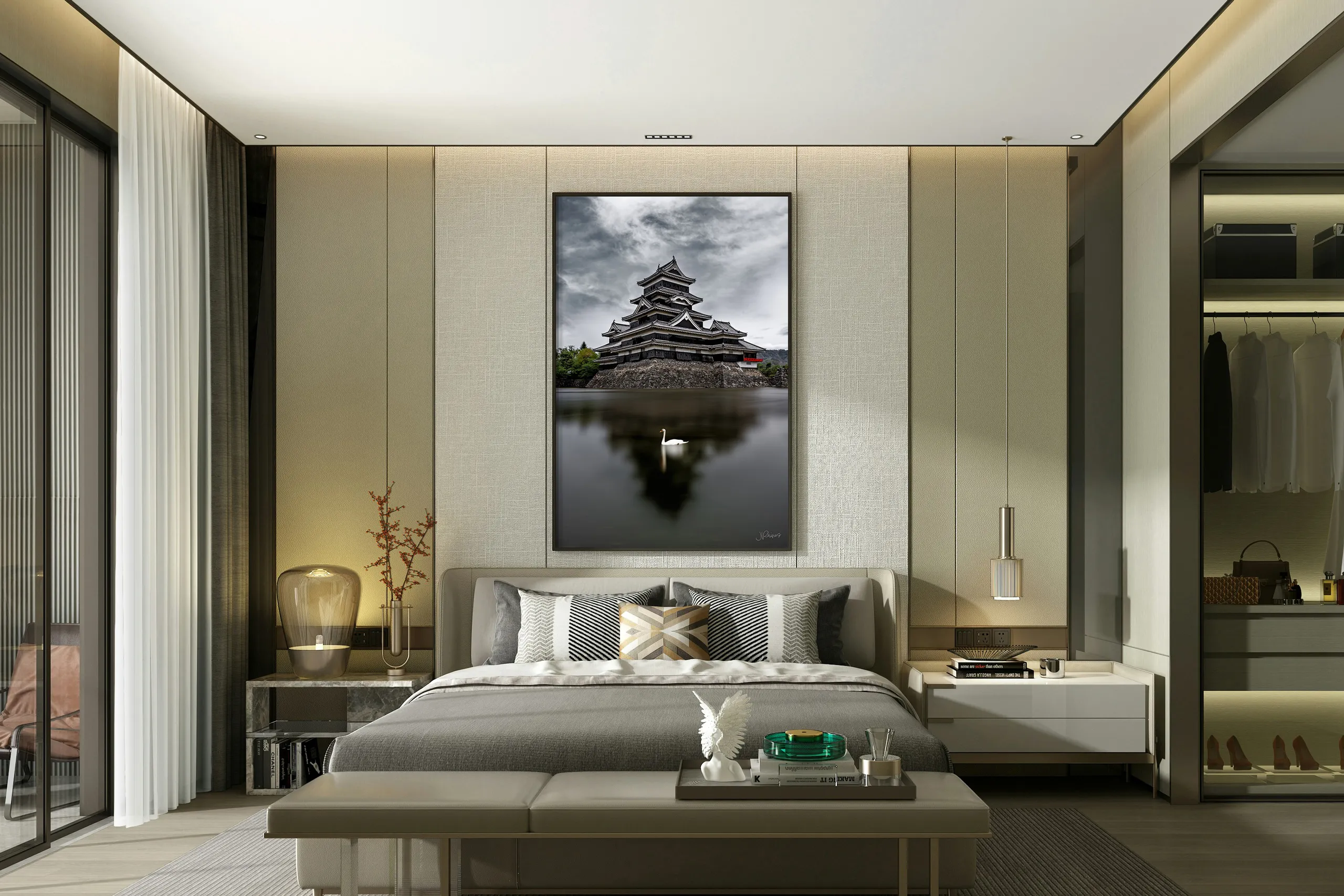
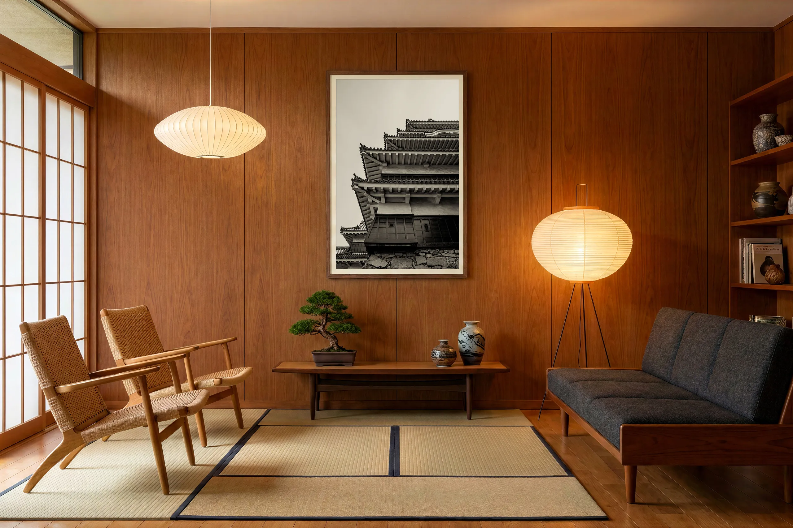
Choose it for: quieter work, black and white, and anyone who already has a framer they trust.
Side by side
Prices are the 24 × 36 standard size, so they're comparable — every size is published on The Prints page.
| Paper | Supralume | Metal | Lumachrome | |
|---|---|---|---|---|
| Best for | Tone, B&W | Texture, atmosphere | Bright, high-key | Depth, drama |
| Surface | Smooth matte | Gloss, canvas texture | Gloss, smooth | Anti-reflective acrylic |
| Glare | None | Some | Some | Least — under 1.5% |
| Arrives | Unframed | Ready to hang | Ready to hang | Ready to hang |
| Damp rooms | No | Water-resistant | Yes | No |
| Rated life | 100+ yrs | — | 65 yrs | 120+ yrs |
| 24 × 36 | $425 | $1,250 | $1,400 | $2,450 |
Then check the room
Once the image has narrowed it to one or two, the room decides. Three things are worth actually looking at:
- What's opposite the wall? A window or a lamp directly across from the piece is the main argument for acrylic, and the main argument against untreated glass on a framed paper print.
- How close do people stand? In a hallway or a stairwell people pass within a couple of feet, and surface texture becomes part of the experience — canvas and paper reward that. Across a large living room, the luminosity of acrylic and metal carries further.
- Is it damp, or does it need wiping? Kitchen, bathroom, a hallway with kids. That's metal, and it isn't close.
One thing that applies to all four: don't hang any of them in direct sunlight. It's the single biggest factor in how a print ages, and no rated life assumes it.
What I'd actually tell you
Most people arrive assuming this is a budget decision with a "best" option at the top. It isn't. I've talked plenty of people out of acrylic and into paper because the picture they'd chosen was quiet and the acrylic would have bullied it.
If you're stuck, send me the image you're considering and a photo of the wall — straight on, with something in frame for scale. I'll tell you what I'd hang there, and I'll tell you if that's the cheaper option, because I'd rather you have the right piece than the expensive one.
Still deciding?
Tell me the image and something about the room — the light, the wall, how close people stand. I'll tell you honestly what I'd hang there, even if it's the cheaper option.
Ask me directlyPrefer email? hello@jeradrainesphotography.com